

Of paper and Smoke, detail
When I arrived in Taiwan for my two months residency, I did not really know what to expect; I was actually quite nervous about my new project, and the limited amount of time I had to complete it.
Inspiration
First of all I had to come up with an idea. In the proposal I had written eight months earlier, I said that I would inspire my work from my personal experience of the local culture; well, one of the great things about Taiwan, and Tainan especially, is that culture hits your senses from every corner of the streets.


Since the very first weekend I was there, I started witnessing events and celebrations that filled up my ears, my eyes and the memory card of my camera. I realised how strong a relation is still present between local communities and their religious beliefs and I decided to consecrate my time to a deeper understanding of those florid ceremonies.

It is always time for a tea at the temple
I approached local temples with my questions; most of the time my interviews ended up in silent series of nodding and pointing and smiling as my Chinese skills were equal to zero. Sometimes I just hid my frustration and embarrassment and cycled away, some other times the language gap was filled up with food and I ended up having tea and God-blessed biscuits.
First sketches

First experiments inspired by local iconography
After collecting images and ideas, I started giving a structure to my work. I mentioned in my previous post that Soulangh was not my initial choice as I did not think I would be able to work on a big scale project. At the beginning I was even a bit intimidated by the work of other resident artists, that were able to build complex structures with a variety of materials, to master the space and engage the audience.

Peter Fritzenwallner‘s exhibition at Soulangh
My first idea consisted in a series of layered papercuts to be framed and hung on the walls of the Children’s Museum.

First experiment of a layered illustration.
The scale was intended to be small, but I knew from the very beginning that I was interested in working with light and experimenting with the lightbox technique, taking the inspiration from the work of artists that already excel in it:


I started with small mockups, to study the relation between the different layers and their level of transparency. The effect can be very magical because the shade of the paper changes according to the distance from the light source, and the elements that are more distant from the eye seem to be fading away.

The same image, front and back lit.
The mockups became more and more detailed: I started sticking them on the window of our living room to have a better idea of the effect they would make.


Thinking on a big scale
Two months are a very short amount of time to create, coordinate and launch an exhibition. After one week of experimenting, the very organized people at Soulangh made sure I did not get lost in my paper microforest and asked me to choose a location in one of the two buildings of the Children’s Museum and to provide the list of material I needed for my installation.
This is when something clicked in my head.
I had a budget, professional help and a space, and I just wanted to produce some small papercutting? That was it?
I went to the meeting with my safe and comfortable option of small lightboxes, but then I asked: “If I wanted them to be big, let’s say as high as this wall, would it be possible?”
“Yes, why not?” (this is the answer I got most of the time)
“Oh, ok… Well, let’s go big then.”
This is what is amazing about a residency: you are encouraged to explore a bit further, to risk and do something never tried before.

Defining Space, Miha Štrukelj’s installation at Soulangh
I frantically started researching about a system that could hold a 2-metre high, multi-layered papercut; fortunately there were skilled people around me and in particular Miha Štrukelj, that was in the process of finishing his spacial installation, gave sense to my random sketches and helped me structure my idea.
“Can I build a wall here?”
“Yes, why not?”
And in little more than one week, the in-house builders fitted a brand new wall in the space and built three massive frames, ready to host my work.

Stages of the wall building, observed from my desk.
The design
In the meanwhile I had chosen and developed the three scenes that I wanted to represent in my papercut:
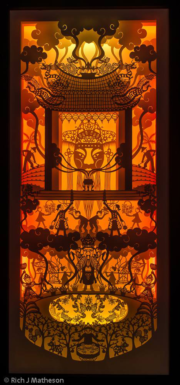
The celebration of Chí Wáng Yé in Hibu, Madou, where mediums, possessed and protected by the god, immune to pain, self inflict wounds with ceremonial weapons in a feast of fireworks and thick smoke.
The Wang-Yeh boat burning in Donggang, where every three years an immense crowd accompany a ceremonial boat and worship the gods asking to carry demons and plague away from the city.
The worshipping of Banyan trees, or Rong-shu, centenarian creatures full of wisdom and tolerance, asked to protect and guide the population. A 300-year-old Banyan tree welcomes travellers in the South of Jiali.

Me and my papercuts, in the beautiful photos of Rich J Matheson
I scaled up the small mockups to one third of the actual size and studied the position of every element within the three levels. The design started to reach the level of complexity I was interested to obtain.
During my stay at Soulangh, I joined a workshop for children and teachers about traditional taiwanese papercutting. The main difference from western papercutting is the act of folding: paper is folded multiple times, then cut and opened back to reveal a pattern often unexpected.
I decided to introduce this aspect in my design and to fold my paper in half along the vertical side; this way I could obtain a symmetrical structure while keeping an overall freedom. I also decided to introduce elements of traditional chinese papercutting within my drawings to create a dialogue between two styles and cultures.
I really like the work of Tim Budden, a Welshman living in Taipei, and I noticed how he, as well, mixes vertical symmetry, traditional patterns and personal taste in his design:


The cutting
It was finally time to start cutting.
When choosing the paper, I had to find the right balance between thickness and transparency; also, because the paper had to be cut while folded in half, I had to make sure that the the two layers together would not be too thick, or it would have been to hard to cut. The size was an issue as well: I needed sheets of paper taller than 2 metres. Although I would have loved to work with rice paper, that was not an option as it would have been too fragile and thin, and my papercuts needed to be able to self stand a little bit. I finally opted for a roll of 140gsm matt printing paper, and it worked just fine.

The first cuts on the first layer of 9: a long way ahead.
With the mockups as a reference, I drew my design at the actual size on a thin sheet of paper, adding all the details and pattern I wanted to cut. When the sketch was ready, I stapled it on the folded paper to make sure it did not move, and using a cutting mat I followed my design from the top to the bottom, cutting the drawing with a surgical blade. This was a very delicate process as a mistake could mean having to start the cutting process all over again. Few times my blade went the wrong way though, but I could adapt my design to the new cut.

The first layer seemed like taking forever : I had to schedule my time to make sure I would be able to finish on time.

It was useful to take a step back (or up) to have an idea of the whole design.


Little details were very important to give complexity and movement to the work.
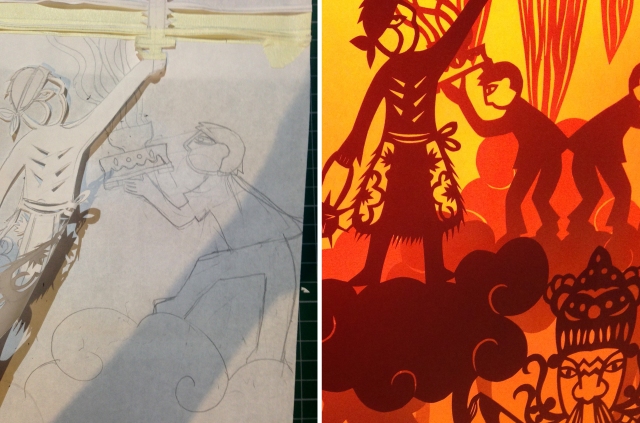
Adjustment of the design from sketch to papercut
Every time a layer was finished, I used the thin paper that was left from the process as a reference for the design of the next level: each element and character had to be placed consistently with the others below and above them.
Mounting the papercuts
After the nine levels were finally ready, I mounted them on the frames, with the help of Bing, the most patient and hardworking assistant one could dream of.

Stretching and stapling the papercuts on their frames.
We stapled every layer on one wooden frame and carefully fitted them one by one inside the windows in the wall, placing a white background on the last frame.
Ten long screws kept the frames in place and sandwiched the system tightly together.

The back of the wall with one frame fitted in and the long screws ready to keep together the layers.

The three papercuts mounted on the wall.
Lighting design
The last part of my work consisted in studying the light effects.
I placed four tubular LEDs around the back of each work and the result was pleasant, but not quite right: in Taiwan white is a color of grief, as many people told me when they visited me in the studio during the cutting process. They asked me if I was going to paint the paper red and they were a bit concerned when I answered that I was going to leave it as it was.


I then thought of a work from one of my favourite artists and inspiration, Andrea Deszö‘s installation Sometimes in my dreams I fly.
In her large scale 2010 installation, the artist uses coloured light as an element of the narrative; I found a video made by Rice gallery where she generously shares some technical details and behind the scenes of her work.
I asked if it was possible to find some gels to cover the LED lights.
“Yes, why not” was the answer.

View from the back of the installation, with a range of coloured gels and cellophane sheets to choose from.
I spent the following three days sticking bits of coloured cellophane onto the white lights and running to the other side of the wall to check the effect.

A candy papercut.
At the beginning I let myself go a bit and ended up with some kitsch effects, but after few days and a lot or running I found the right colour palette for each work and and a good overall balance.


Few more touches and the papercuts were ready to be exhibited.
And there it was finally my work, the result of two incredible months of work and life at Soulangh.

Final installation, photo by Rich J Matheson

Of Paper and Smoke, photo by Rich J Matheson
Of Paper and Smoke, 1_Temple, photo by Rich J Matheson

Of paper and Smoke, 1_Temple, detail

Of paper and Smoke, 1_Temple, detail

Of Paper and Smoke, 2_Donggang, photo by Rich J Matheson

Of Paper and Smoke, 2_Dongang, detail

Of Paper and Smoke, 2_Dongang, detail

Of Paper and Smoke, 3_Banyan, photo by Rich J Matheson

Of Paper and Smoke, 3_Banyan, detail

Of Paper and Smoke, 3_Banyan, detail

Final installation and papercuts look superb. The coloured lights really add an extra energy and life to the images. Love it!
Amazing work, I’m blown away. Such energy and perseverence! Bravo!!